
Studio practice · Interior Architecture · Brand Identity
Arka Design Consultants.
Editorial brand for an editorial firm.
Editorial brand for an editorial firm.
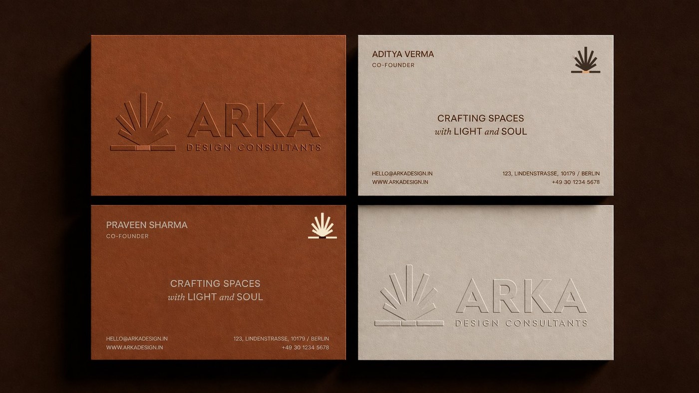
Arka’s built portfolio is the kind of work that wins commissions on its own — restrained interiors, considered materials, projects that feel residential even at scale. Their work belonged in design publications.
But their existing brand identity didn’t reflect the work. Generic logo, off-the-shelf typography, business cards that looked like every other architecture firm in the city.
Every meeting started with their work having to overcome their brand. We were hired to flip that.
We treated the identity system the way Arka treats interiors — restrained, material-led, intentional.
Letterpress business cards because the firm builds with care, not speed. A serif wordmark that holds its own next to architectural drawings. A grayscale palette with one warm accent that lets project photography lead.
The brand became the firm’s first impression — finally telling clients what the portfolio would have anyway.
Clients now arrive already convinced. The work used to do all the persuading; the brand finally pulls its weight.
— Principal Architect, Arka Design Consultants