
Studio practice · Luxury · UI/UX Design
Diorra eCommerce App.
Apple-store polish for jewelry shopping.
Apple-store polish for jewelry shopping.
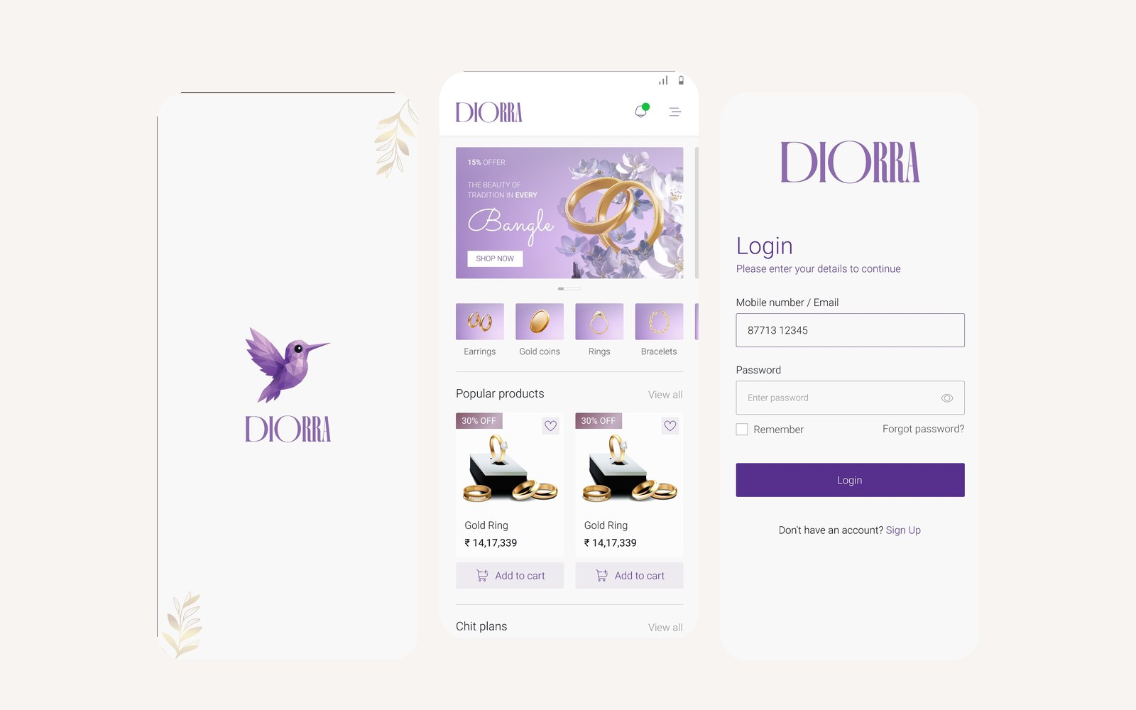
Diorra’s founders had the heritage, the product, and the brand identity. What they didn’t have was a digital expression that matched the in-store experience.
The first prototype looked like every other eCommerce app — generic carousels, default Material components, stock product cards. For a jewelry house selling pieces at premium price points, that gap was a conversion killer.
They needed an app that felt like Cartier, not like a Shopify template.
Premium feel doesn’t come from more features — it comes from fewer, executed better. We built a design system around three principles: editorial typography, generous whitespace, and motion that feels considered (never decorative).
Every screen was designed twice — once for function, once for feel. The second pass is where premium lives.
We worked through 30+ screens covering the full path from login → discovery → product detail → wishlist → checkout → order tracking. Each screen passed a single test: does this feel like an object you’d want to hold?
I’ve seen jewelry apps that cost ten times this much and look like spreadsheets. Manav understood luxury isn’t a colour — it’s a discipline.
— Founder, Diorra