
Studio practice · Luxury Jewelry · Brand Identity
Diorra Brand Identity.
Heritage feel. Contemporary execution.
Heritage feel. Contemporary execution.
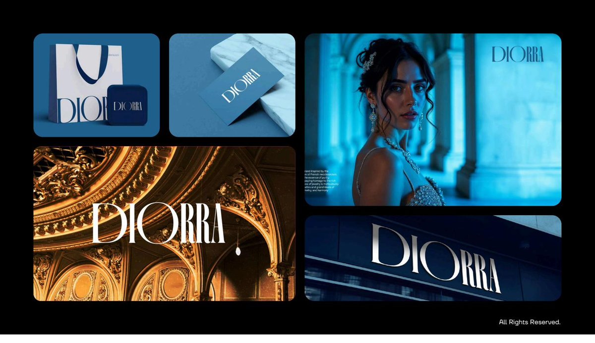
Diorra’s founder inherited a jewelry business with decades of heritage — and a brand identity that hadn’t been updated since the 90s. The challenge: build a new identity that didn’t throw away the legacy but also didn’t look like 1995.
The new generation of customers expected something contemporary, photographable, social-ready. The existing brand couldn’t deliver any of those without feeling out of place.
We chose a hummingbird as the brand mark — light, precise, instantly memorable, and unbeholden to jewelry industry visual cliché (no diamonds, no Art-Deco fans).
The typography pairing is the work: a soft contemporary serif for headlines, a clean geometric sans for support. Together they read as inherited — but not stuck.
The full system covers logo, type, color, packaging, and digital application. A jewelry house should photograph well, and Diorra finally does.
My grandmother would recognize the values in this brand. My daughter actually wants to wear the products. That’s the bridge we needed.
— Founder, Diorra